California Continues to Rewrite the Rules of Design
For good or ill, California is always a barometer of our collective future: a mashup of global cultures, a cradle of new technologies, the gathering place of political storms and social movements and a harbinger of climate change's impacts. It's the state where cults are founded, stars are born and limits are tested.
Like the emigres who fled the dusty air and outdated ideas of the East Coast and Europe for the clean air and sunshine of California, artists and designers in the state found their voices by breaking from modernist traditions and embracing the light, color and playful attitude of the West Coast. The visual language that has emerged from the Golden State continues to rewrite the rules of design through the unrestrained use of color, stylistic hybridity and the juxtaposition of high and low culture.
Midcentury modernist Space Age design
Graphic design can be broadly understood to include everything from billboards and poster art to album covers, book jackets, film titles, menus and street signs. The advent of digital design has further expanded its scope. April Greiman, the transmedia artist who used the computer to craft a new aesthetic in the 1980s, felt the term "graphic design" was too limiting. After she became head of the California Institute of the Arts' design department in 1982, she lobbied to change its name to "visual communications."
California's graphic design history can be traced back at least to the late 19th century, but the postwar period saw an explosion of creativity. The state's growing population, revitalized industries and consumer optimism led to the creation of a new, modern lifestyle that was exported globally. Midcentury California was a hub for experimentation, innovation and style: surf and hotrod culture, aeronautics and engineering, plastics and atomic energy, Barbies and fast food. It was the time of wacky Googie-style coffee shops and gas stations, with cantilevered roofs and starbursts designed to catch the eye of passing motorists; and the Case Study House Program, which would, wrote Arts and Architecture editor John Entenza, use "many war-born techniques and materials" to rethink the private home. It was this fascination with the future and its promise that seeped into the aesthetics of the day.
Disneyland opened in 1955, with the Space Age-themed Tomorrowland delivering what Walt Disney described as "a living blueprint of our future." Its Googie-inspired architecture, rides and exhibits, and space-travel imagery showed the possibilities to come.


Disney animator Mary Blair created the whimsical design and color scheme for "It's a Small World." The ride was created for the 1964-1965 New York World's Fair.
Like many California designers, Blair was inspired by Latin America, whose proximity to California influenced much of the region's look and feel. In 1941, she joined fellow Disney Imagineers for a three-month tour of South America, later capturing the spirit and color of those places in her concept art for classics such as "Cinderella," "Alice in Wonderland" and "Peter Pan."
With the rise of commercial aviation came a golden era of travel – and of travel posters. California-based illustrators like Stan Galli and Fred Ludekens used vibrant colors and romantic images to persuade the Mad Men-era leisure class to go on glamorous getaways.
Color and pattern were boldly employed in environmental graphics. Marion Sampler, the longtime head of the graphics department at Victor Gruen and Associates, became one of the first African American architectural graphic designers in Los Angeles. He's best known for designing the stunning, kaleidoscopic stained-glass dome at the South Coast Plaza shopping center in Costa Mesa in 1973. He also designed architectural graphics for Joseph Magnin specialty stores, the Beverly Hills Civic Center and the Pacific Design Center.
Psychedelic graphics
From tie-dyed clothes to the liquid-light projections at live concerts, the 1960s were soaked in color. John Van Hamersveld's iconic "Endless Summer" movie poster, with its high-contrast silhouettes of surfers melting into the blood-orange sand, yellow sun and hot-pink sky, laid the groundwork for a generation of designers. Van Hamersveld went on to create album covers for The Beatles, The Beach Boys and The Grateful Dead.


San Francisco was the hotbed of '60s counterculture, and it's where rock poster artists, notably Victor Moscoso, Wes Wilson, Alton Kelley, Stanley Mouse and Rick Griffin, used condensed and distorted hand-drawn lettering, complementary colors and elements of collage to evoke the visual chaos of the concerts, the rebellious ethos of the counterculture, the hallucinatory effect of psychotropic drugs, and the political and social instability of the times. Moscoso had studied color theory under Josef Albers at Yale, where he learned to juxtapose colors at opposite ends of the color scale to create a "buzz of confusion" for the viewer.
Meanwhile, the Light and Space movement took hold in Southern California, with artists like John McCracken, Larry Bell, Robert Irwin, Helen Pashgian, Lita Albuquerque and James Turrell combining minimalist sculpture with bold solid colors that capture California's unique light and sense of space.
Colby Posters
Colby Poster Printing Company, the family-owned, all-manual L.A. print shop, cranked out posters from 1948 until 2012. Their signature fluorescent colors and woodcut typography announced upcoming concerts, mariachi shows, boxing matches, political campaigns, and movie premieres. Colby made strong use of the split fountain or rainbow roll, a color printing technique developed in the late nineteenth century and re-popularized by "The City of San Francisco Oracle," the 1960s psychedelic underground newspaper. The flashy, attention-grabbing posters were affixed to telephone poles and fences, and meant to be readable from the window of a moving car, the bright colors visible in the sunshine.
Colby Posters had a large impact on Los Angeles street style. Artists including Allen Ruppersberg, Ed Ruscha, Daniel Joseph Martinez and Eve Fowler commissioned work from them. L.A.-based artist and graphic designer Brian Roettinger channeled Colby Posters and the punk scene of the '80s and '90s in product packaging for the bands No Age and Liars. So too did Julia Luke, in the rainbow-gradient graphic identity for the Hammer Museum's inaugural Made in L.A. biennale in 2012.

Rainbow connections
In 1978, San Francisco gay rights activist Harvey Milk tapped artist-activist Gilbert Baker to design a symbol of empowerment for the queer community. Baker created the rainbow flag as a symbol of hope to replace the pink triangle, which Nazis had used to identify gay prisoners. Baker's original flag had eight colors; pink and turquoise were dropped the following year.

In an autobiography, the Wichita native recounts how he, like Dorothy from "The Wizard of Oz," traded a sepia-toned life in Kansas for San Francisco's color and diversity. He knew how color could shock: the provocateur showed up at a 1990 pride parade as "Pink Jesus," fully covered in pink body paint, wearing only an American-flag loincloth and tied to a cross with a sign that read "Martyrs for Art."
This June, a newly rediscovered segment of Gilbert Baker's original 1978 flag was returned to San Francisco and donated to the GLBT Historical Society Museum and Archives. The rainbow flag was also added to the Museum of Modern Art's permanent collection in 2015. Baker refused to trademark the flag so that it could be free for anyone to use. Multiple designers have updated it in recent years, adding new stripes to be more inclusive of queer people of color and trans people.

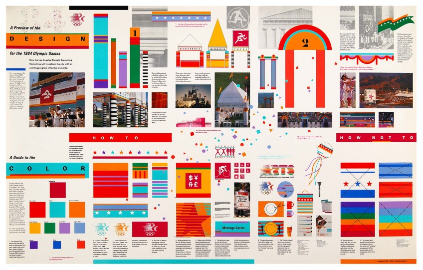
The L.A. 84 Olympics
California designers have long drawn inspiration from Mexico and Central and South America. Muticolored Saltillo serapes and Mayan huipils, the Mexican muralists of the post-revolutionary 1920s and 1930s, Luis Barragán's pink walls: these have all been touchpoints for California design.

Influential L.A. designer Deborah Sussman began her career in the office of Charles and Ray Eames, where she collaborated closely with Alexander Girard and developed an interest in Indigenous cultures and folk art, particularly of Mexico. When she was tasked with conceiving the design identity of the L.A. 84 Olympics, she looked to the work of American graphic designer Lance Wyman, who created the design strategy for the 1968 Mexico City Olympic games. Wyman created a logo with curvy lines radiating from the '68 Olympics logo, color-coded pictograms and other visuals inspired by Mexico's Indigenous history.
Sussman, with her husband, architect Paul Prejza, and architect Jon Jerde, created a "kit-of-parts" visual alphabet that could be adapted for each venue. Street banners and pylons used a bright palette (magenta, vermillion, aqua and chrome yellow) inspired by Sussman's travels in India, China, Japan and Mexico.
Like in Mexico City, L.A.'s games were held at repurposed structures scattered across the city. Sussman's environmental graphics served the purpose of placemaking and wayfinding, helping visitors navigate L.A.'s sprawl while giving the city a cohesive visual identity that celebrated its diversity.

Technology and design
The graphic design industry as a whole was slow to warm up to computers as not just tools of design, but sources of new aesthetic possibilities. April Greiman saw their potential early on, buying the newly-released 1984 April Macintosh to layer images and text and break from the formal grid. Greiman, who had studied at the legendary Basel School of Design, referred to the California New Wave design movement she helped usher in as "the Swiss school on acid."
In 1986, Greiman guest-designed an issue of the influential Design Quarterly magazine. The issue, entitled "Does It Make Sense?," unfolded into a 3' x 6' poster and contained a life-size, nude self-portrait surrounded by images and text, all made with MacDraw. Greiman's posters and magazine covers, and her collaborations with artist and designer Jayme Odgers, went on to influence Wired magazine's early covers and the GeoCities-era Web aesthetic.
Desktop publishing forever changed the graphic design profession, and Berkeley-based digital type foundry and magazine Emigre led the charge. Founded in 1984, coinciding with the birth of the Mac, husband-and-wife team Rudy Vanderlans and Zuzana Licko were pioneers of digital type, with hundreds of independent foundries following in their footsteps.

Color, light and designing today
April Greiman, in an AIGA interview, recalled how L.A.'s sunsets inspired her use of color. "I remember being mesmerized every day around sunset when this golden light, this pink gold light, would just drape the whole city. It was spiritual... I ended up doing some early work, even corporate work, in bright colors and DayGlo orange."
Shortly before her death, Deborah Sussman told an interviewer she was inspired by "the colors of the fading and then bright sunset sky behind the poplars and eucalyptus trees" in her garden.
The color and light of California, and the work of past designers, continue to influence.
The L.A.-based spatial designer Adi Goodrich, co-founder with director Sean Pecknold of Sing-Sing Studio, is known for her bold use of shapes and colors in all of her wide-ranging projects, and cites Mary Blair as an inspiration. For example, an art installation called "A Perpetual Sunset" for an Instagram office is made up of cascading rainbow arches flanked by lavender palm fronds that ends in an L.A. sunset.
The Grammy-winning graphic designer Lawrence Azerrad also draws from L.A.'s colors, and cites Sussman as a major influence. While working with the Red Hot Chili Peppers on their album art for 1999's Californication, he wanted to evoke the colors of '70s psychedelic rock posters. The album cover shows a swimming pool that contains the fiery orange of an L.A. sunset, while the sky is made up of an upside-down picture of blue water taken near the Santa Monica Pier.
Or check out the work of Jackie Rivera, a Seattle-based designer and artist who draws from the colors of her California upbringing, Latinx heritage and '70s art and design in her lettering and illustrations for the LA Times' "Latinx Files" newsletter, commercial work for Snapchat and Facebook, and more. She reflects a new generation of designers who infuse the colors and cultures of California into their work.